If you’re looking to be remembered in the real estate industry, one of the easiest ways to do it is with a good brand logo for your business.
A great logo will help you cut through the noise and help you immediately stand out when your potential prospects and past clients see your logo.
Which is why we’ve put together this guide on real estate logo ideas.
In it, we’re going to give you a handful of design tips to help ensure your logo stands out and makes a great impression, along with a few of the worst examples.
We’ll also show you some great examples, what makes them great, and introduce you to a few AI tools that will help you create your new logo without hiring a brand designer.
To kick things off, let’s touch on how to create a great logo…
6 Real Estate Logo Design Tips
Each of the tips below will help you develop a strong foundation for your logo.
And, remember, ask other people what they think about it once you’ve put one together.
#1 – Be Choosy With Your Font
While many real estate professionals believe that a font is just a font, when it comes to designing your logo, nothing could be further from the truth.
The study and practice of font design is a discipline that can take years to master as a designer.
Fortunately, for you, most of the hard work has already been done.
Some of the world’s most talented designers have spent their careers dedicated to font design.
That means you won’t have to spend hours trying to sift between what looks great and what doesn’t because most of it has been figured out for you already.
You can use a tool like Font Shop to see what your logo will look like with hundreds of different types and styles of fonts so you will want to spend a bit of time being choosy about the font you use — and then send it to your designer or plug it into one of the tools we’ll recommend later in this guide.
#2 – Simplicity Over Complicated
A great design will speak 1,000 words and send a very focused message to your prospects.
When you have the design dialed in, it’s a message that will be immediately understood.
In many cases, that means simplicity is going to win over a complicated and cluttered design.
Rather than trying to convey anything and everything you can think of with your logo, do what you can to keep the design as simple and as timeless as possible.
This approach will not only make it easier for your prospects to understand the message you’re trying to get across but it’s also going to make sure your design looks great in various different sizes & formats.
#3 – Scale It For All Dimensions
Which, speaking of sizes and formats, you want to ensure it looks great everywhere — not just in the software or tool you’re using to design it.
Spend some time figuring out what it looks like on phones, on tablets, on desktops and laptops, in print, and everywhere else you plan on using it.
From contracts to your business cards, to your website, in your emails, and even on your social media profiles, you want to ensure that the logo looks great in all formats.
You can have your designer mock up various different sizes and formats or use one of the tools we recommend to produce varying sizes for you to test.
#4 – Compare It To Your Competitors
Before you finalize your design, take some time to compare it to your competitor’s logos.
This means you’ll want to have a collection of your competition’s designs so you can stack yours against theirs to determine whether or not yours stands out.
If you were a buyer or seller or someone else in your prospect list, what would you think about your company based ONLY on the message your logo is sending?
How does it compare?
Does it look better than your competition? Worse?
Spend time upfront figuring that out before you go to the final design to save yourself a ton of time and energy down the road.
#5 – Get Inspired
There’s an old phrase that works great when you’re designing a real estate logo: talent borrows, genius steals. That means you’ll want to get inspired by other designs and, if needed, steal design elements for your own logo.
Now, we’re not talking about ripping off another logo and using the exact design on your own. That’s copyright infringement and is illegal almost everywhere.
Instead of landing yourself in hot water or even getting sued, use the design elements as inspiration for your own design. What is it about the logo that you like? What don’t you like? How can that be adapted to your own?
#6 – Keep It Real Estate Focused
When it comes to your design, you want your prospects to know that you’re in real estate as soon as they see your logo.
One of the things you don’t want to do is create a boring, generic design that doesn’t speak to you being an agent or investor.
To avoid this, take inspiration from other real estate logos.
Don’t make the mistake of trying to imitate a great attorney logo, or sports logo, fashion logo, whatever it is that you come across that you like.
Keep it focused on real estate so it helps get your message across when prospects see the design.
Terrible Real Estate Logo Designs
Now, to help you understand what not to do, and see it in visual form, we’ve collected some of the worst real estate logos that we’ve ever seen.
When it comes time to plan your design, staying as far away from the ones below as possible is not a terrible idea.
#1 – Weichert Realtors
You can probably look at this one and see what we see.
It starts with an odd looking font, overly crowded text, and a bright yellow background. The rectangle with rounded corners is definitely 2001 design nostalgia.
This can all be avoided by starting with a great looking font and thinking about layout and color.
#2 – Exp Realty

At first glance, you may think this is a great looking logo. Which, we would probably agree.
But once you start looking under the hood you’ll realize that it’s actually a pretty terrible design.
Remember the tip we mentioned on ensuring it looks great in multiple different sizes and formats?
At smaller sizes, this logo begins to distort. Then, on something like paper where it’s hard to print the 3D look, it falls flat and begins blending together.
If you tried putting this logo on fabric you would be pulling your hair out.
To avoid these mistakes, stay away from 3D designs, color fades, and high levels of anti-aliasing.
#3 – Exit Realty
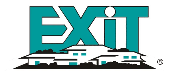
Another design that’s immediately recognizable by most real estate professionals is the Exit Realty logo.
It’s one of those designs that you think looks great on the surface but, as you begin digging deeper, you start to see the faults in it.
In this case, it’s using a standard stock photo house design and outdated fonts.
Adding the registered mark or copyright mark to it, while using stock photos, makes this logo a no-go.
#4 – National Association Of Realtors
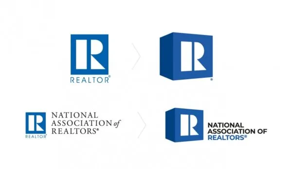
Now, we may take some flak for listing this one on here, but it is, in fact, pretty terrible.
In this example, the design feels like it’s straight out of the 1960s, even after they did a major brand update.
The combination of 3D effects, outdated font, and minimal colors makes this a design that you should probably stay away from.
If it wasn’t for them being the biggest association for realtors, most of you would never be able to tell what they did by their logo, alone.
Great Real Estate Logo Designs
After you’ve seen what not to do, we want to show you some examples of great logos.
You can take inspiration from the designs below to start putting together something you think would work great in your business.
#1 – Red Oak Realty
Red Oak Realty nailed their design.
If you aren’t familiar, they are a woman-owned real estate brokerage based out of North California’s East Bay with a heavy focus on luxury properties.
When they began their rebrand, they wanted a design that felt fresh but still retained their old design. This bold logo uses upward sweeping letters and simplicity to make a statement without being complicated.
#2 – Williams & Williams

Williams & Williams is another group that focuses on high-end, luxury real estate, and you can tell in the design of their logo.
They help their clients find one-of-a-kind architectural homes which are featured prominently in their logo.
The combination of palm trees, architecture, and gold are featured in a way that speaks luxury.
#3 – Century 21

Century 21 is a globally recognized real estate brand with more than 14,000 locations operating around the world, in more than 86 different countries.
When they rebranded, they wanted to eliminate all outdated typography and design elements.
They achieved that goal with their new logo which is more sleek and sophisticated than their previous design while staying true to their iconic black and gold scheme.
#4 – Global Collective

#5 – Vannessa Kaufman

When it comes to personal branding, Vannessa Kaufman nails it.
She has sold more than $1.5 billion in her 30 years of experience and has become known as one of New York City’s premier brokers for high-end living.
Her dedication, understanding, and concern for her clients shines through in her logo.
If you’re building a personal brand, this logo is a great design to draw inspiration from.
How To Design Your Logo — Without Hiring A Designer
If you’re feeling ambitious and want to avoid hiring a designer to nail your next logo design, you can use some of the AI tools below to start turning out a wide range of designs to choose from.
#1 – LogoAI

One of the easiest tools to use is LogoAI.
With it, you can plug in your business name and slogan and then the tool will spit out a wide range of designs you can choose from.
When you see one that you like, you can download a copy of it to start using in your marketing.
Or, you can take a design that’s close, download it, and send it to your designer with improvements you want to be made to it.
#2 – BrandCrowd
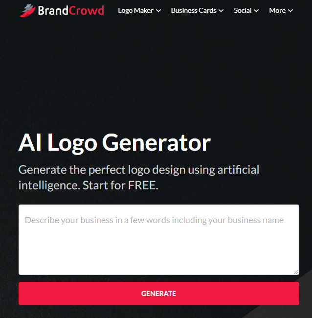
Another great tool, and one that lets you dive even deeper into logo design, is BrandCrowd.
With this tool, instead of just plugging in your business name and slogan, you can also describe what your business is about, who you help, how you help them, and what you’re looking for in the design.
Then, the AI logo generator will produce a wide range of results for you to pick from.
While LogoAI will give you free designs, BrandCrowd charges a small fee for their designs if you find one that you want to use.
#3 – Logo.com AI Logo Maker
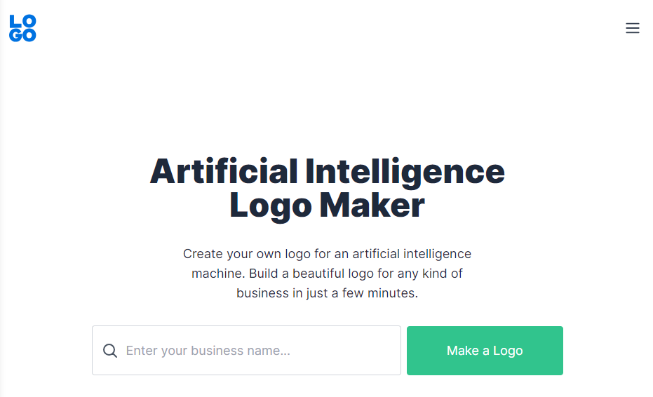
Finally, the next tool on the list is the Logo.com AI Logo Maker.
This is another tool that lets you plug in your business name and start looking through dozens of different designs to find one that you like — or one that’s close to the end result you’re looking for.
Turn Your Logo Into New Leads & Deals
Once you have your design nailed, it’s time to start using it in your marketing.
You can plug your design into Ballpoint Marketing’s proven-to-convert direct mail templates to start creating brand recognition with your prospects.
Then, if you want to be known as a real estate professional that answers the phone for their prospects, you can use a service like Call Porter to answer your calls and set pre-qualified appointments directly onto your calendar.
This combination of marketing tools helps you generate massive traction in your local market, especially when coupled with a great looking logo that gets people recognizing who you are and how you help.


